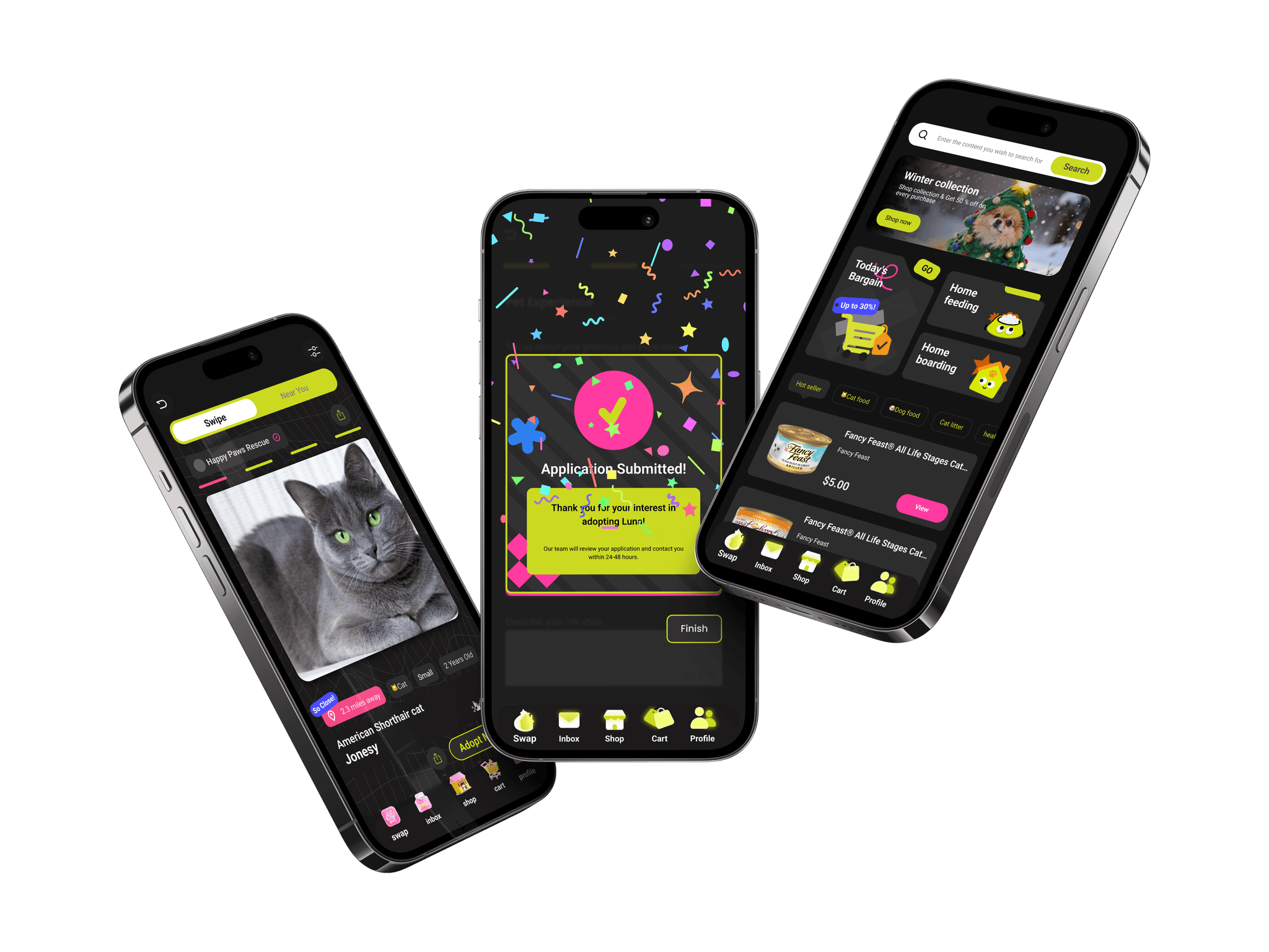
Pet Bridge — reducing friction in pet adoption
A unified platform that simplifies discovery, application, and communication to support smoother adoption experiences.
Independent project
3 months
iOS & Android
Pet care
Consumer product
Overview
Designed one app that carries adopters from finding a pet to bringing it home.
I led the end-to-end design of Pet Bridge, focusing on reducing the uncertainty adopters feel between discovering a pet and successfully bringing them home.
shelter animals were not adopted in 2025, while pet spending hit a record $158B.
interviewed: recent and prospective adopters, shelter volunteers, a rescue coordinator.
of browsing: swipe, tap and slide, from a quick reaction to the full profile.
The solution in two moments
Problem
Adoption breaks down in the gaps between platforms, not for lack of pets or money.
Adopting a pet is exciting, but the process can feel overwhelming. The pet industry is worth over $158B a year, yet adopters still struggle with unclear requirements, slow communication and fragmented systems. Prospective adopters move between several platforms without seeing what comes next, so the excitement of bringing a pet home is often paired with uncertainty.
Research
Interviewed both sides of adoption to find where the journey breaks.
To understand the realities of pet adoption, I ran one-hour interviews with 8 first-time adopters aged 22–65, men and women in different living situations. I wanted to learn how people search for pets, what motivates them to adopt, and where they get confused on existing platforms.
Participants described browsing several listing sites, struggling with unclear requirements, and switching between apps, emails and shelter websites to finish an application. I organized the questions into four themes:
- 01Decision-making factors
- 02Current adoption apps and workflows
- 03Where friction occurs
- 04How users seek updates
“I found a pet I loved, but I wasn’t sure where to start the application or what documents I needed.”Caleb Turner · prospective adopter
Key insights
Adoption journeys feel fragmented
People jump between listing sites, emails and forms without a clear path forward.
Uncertainty creates hesitation
Many adopters aren’t sure how to start or what steps come next.
Communication gaps cause frustration
Updates are inconsistent, leaving applicants unsure about their status.
Shelters face repetitive inquiries
Staff spend significant time answering the same questions.
Adopters seek guidance beyond approval
The moment they were approved, new questions emerged: What should I buy?
These insights revealed a strong need for clearer structure, transparency and continuous communication throughout the adoption journey.
Learning from the system around adopters
Although the app focuses on adopters, insights from shelter teams highlighted where better guidance and clearer expectations could reduce confusion and improve the overall experience.
Synthesis
Defined who we were designing for, and the support they were missing.

- Find a pet that fits his lifestyle
- Understand adoption steps
- Feel confident about the decision
- Doesn’t know where to start the application
- Requirements unclear across shelters
- Long waits without updates
- Wants companionship
- Believes in rescue adoption
- Wants a responsible process
- Status updates
- A simple application
Secondary research
I reviewed major adoption platforms (Petfinder, Adopt-a-Pet, shelter websites, RescueMe, Petango, Home to Home and Animal Planet) to see how they support adopters through the journey. They are strong at helping people discover pets, but most stop at search and listings instead of guiding adopters through next steps.
| Petfinder | Adopt-a-Pet | Shelter sites | RescueMe | Petango | Home to Home | Animal Planet | |
|---|---|---|---|---|---|---|---|
| Find a pet I connect with | ✓ | ✓ | ✓ | ✓ | ✓ | ✓ | ✕ |
| Know what to do next | ✕ | ✕ | ✕ | ✓ | ✕ | ✓ | ✕ |
| Feel informed during the process | ✓ | ✕ | ✕ | ✕ | ✓ | ✓ | ✕ |
| Understand requirements clearly | ✕ | ✓ | ✕ | ✕ | ✓ | ✕ | ✕ |
| Prepare for bringing my pet home | ✕ | ✕ | ✓ | ✕ | ✕ | ✓ | ✓ |
| Get support beyond approval | ✕ | ✕ | ✕ | ✕ | ✕ | ✓ | ✕ |
Limited guidance beyond discovery
Tools help users find pets but don’t explain how to apply or what to expect.
Fragmented communication
Updates happen across emails, forms and separate shelter systems.
Little post-adoption support
New owners get little guidance on preparing for a pet or choosing supplies.
Where adopters struggle, in numbers
Discovery + search
browse multiple platforms before finding a suitable pet
feel overwhelmed by inconsistent listing information
are unsure which platform to trust
struggle to compare pets across sites
Application + process
don’t know what steps come next after expressing interest
find requirements unclear or different across shelters
wait without updates after submitting applications
need to switch between emails, forms and websites
Post-adoption preparation
are unsure what supplies to buy
are unsure what supplies to buy
wish for guidance during the transition period
look for advice after approval but don’t know where
Based on ASPCA National Pet Ownership Statistics, the AVMA Pet Ownership Report and APPA National Pet Owners Survey data.
Behind the challenges are clear needs
Across primary and secondary research, participants wanted simple guidance, transparent communication and reassurance rather than complex workflows. Adopters and shelter staff both stressed reducing uncertainty and making it easier to stay informed at every step.
Ideation
Chose swiping, so people decide while they browse instead of after.
Through brainstorming and sketching, I explored ways to help adopters handle the overwhelming number of pets and unclear next steps, focusing on reducing cognitive load and making discovery feel intuitive and emotionally engaging.
Early idea
Inspired by dating apps, a swipe lets users quickly express interest while lowering the pressure of decision-making. Quickly say: save or next.
Selected idea: a swipe-driven decision flow
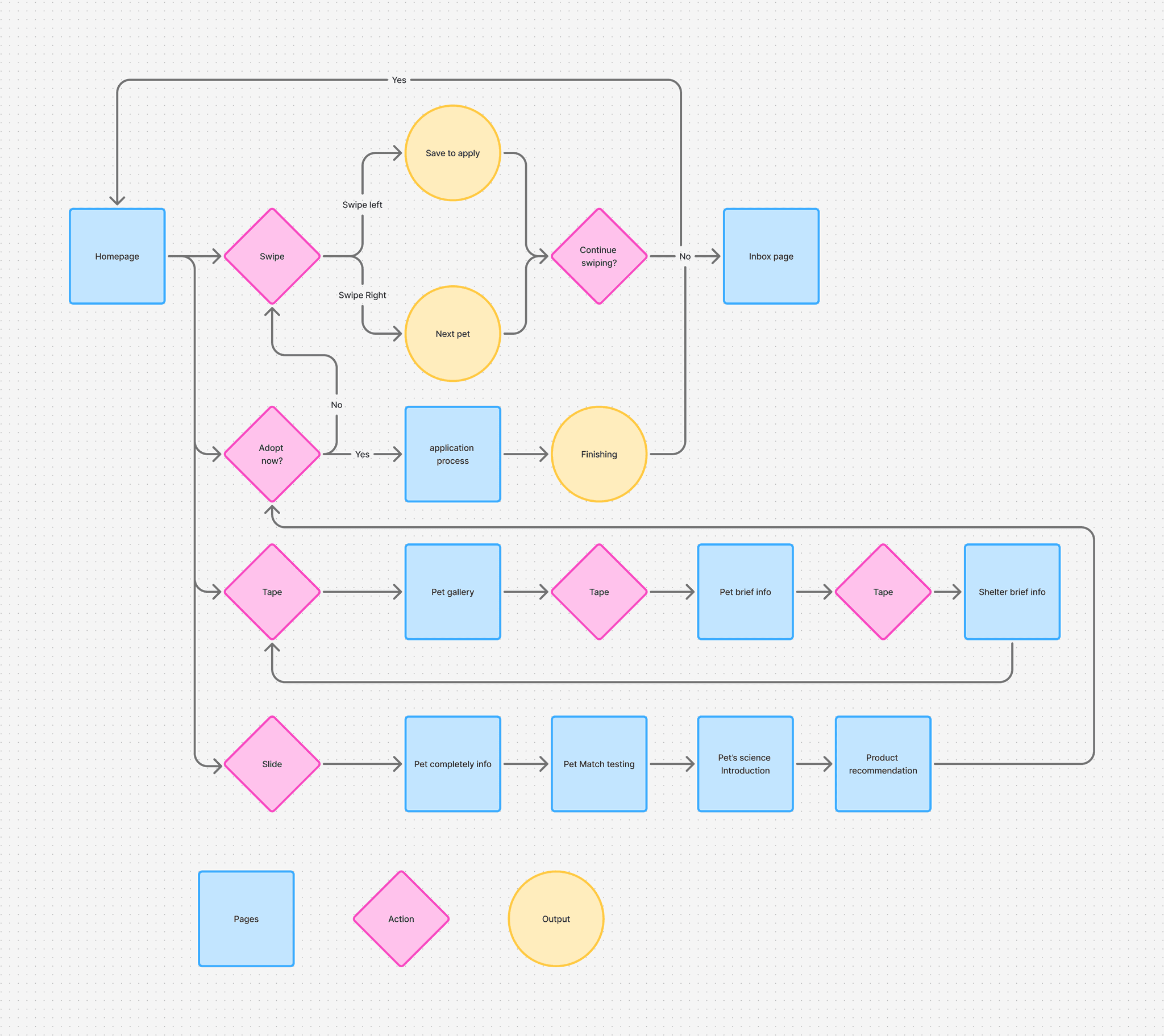
I chose swiping as the core mechanism not because it comes from dating apps, but because I wanted users to decide progressively while browsing pet information, rather than navigating to another page before deciding.
SwipeExpress interest (save / skip)
TapView local details (shelter, personality tags)
SlideExpand full information
A multi-layer interaction flow
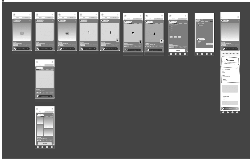
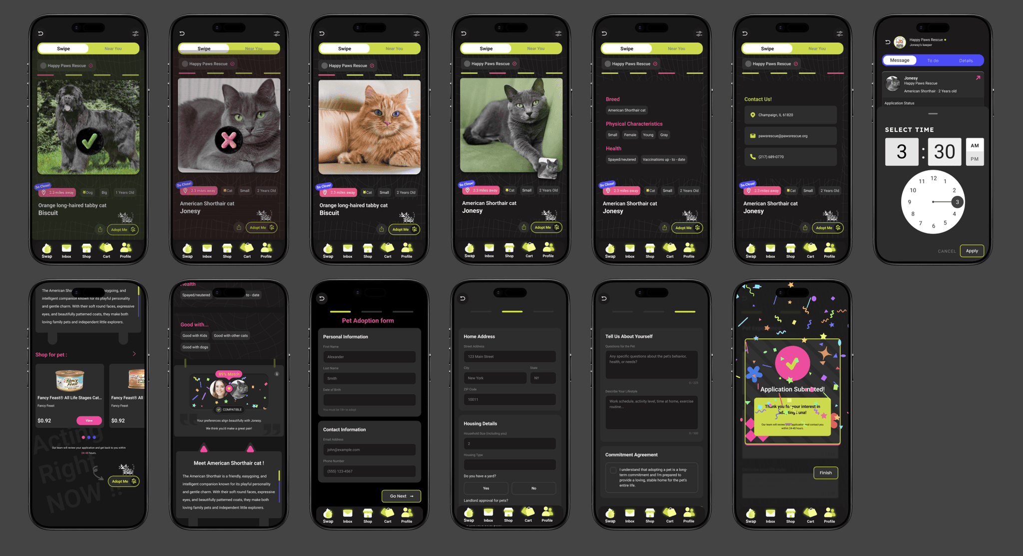
The homepage is a multi-path system where users can explore, evaluate and commit at different depths without losing context. Instead of forcing a linear journey, it supports three parallel modes (swipe, tap and slide), each a different level of engagement.
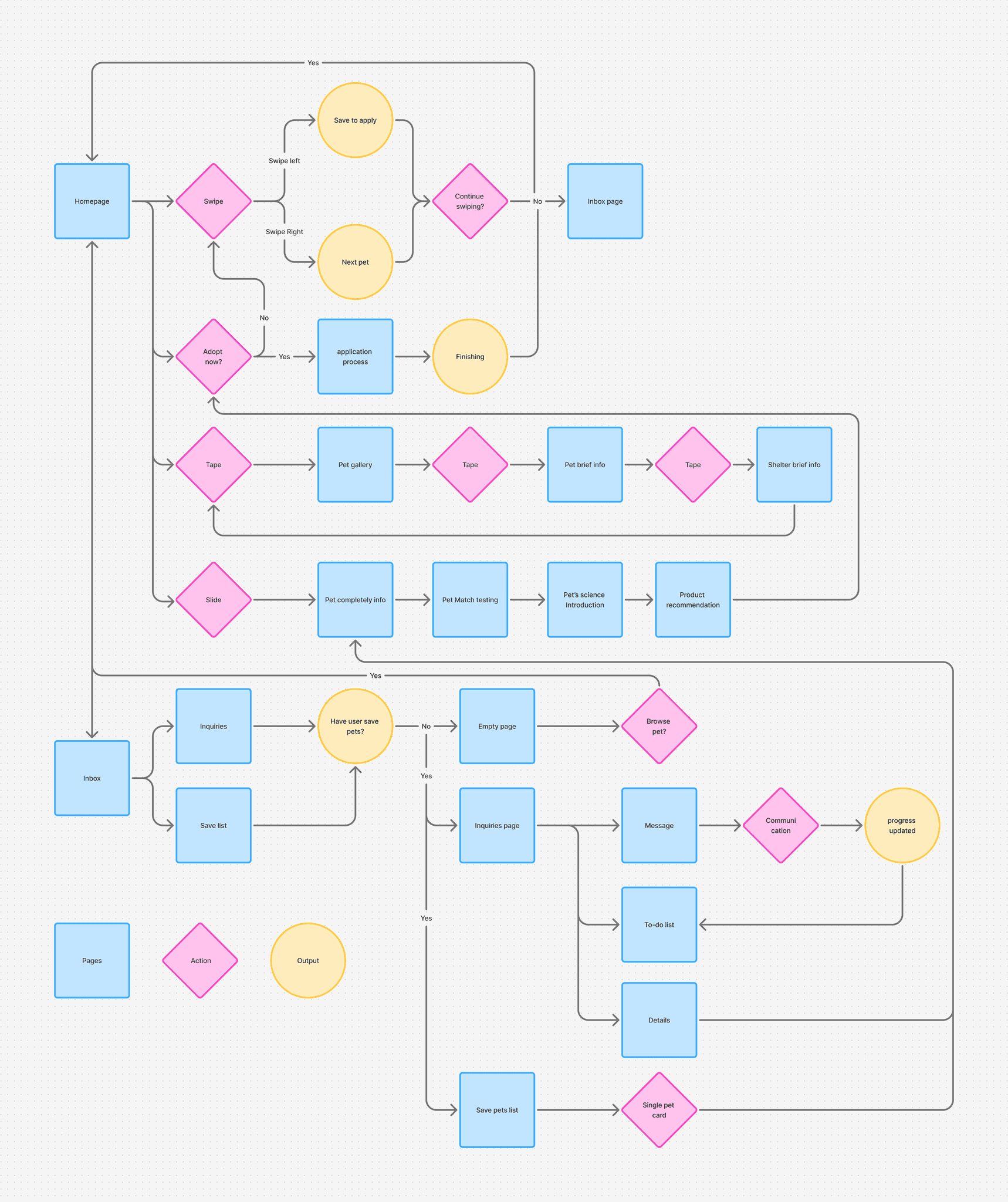
From selection to an integrated pet ecosystem
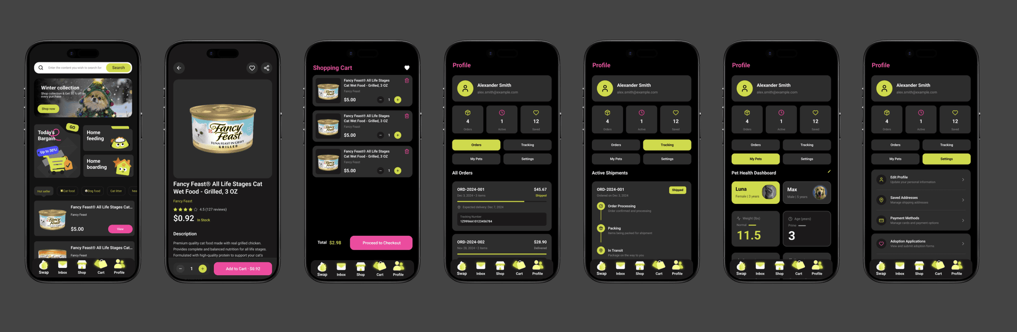
Beyond adoption, the platform expands into pet support that brings product shopping and service coordination into the same environment. Instead of treating adoption as a single transaction, it extends into post-adoption needs (supplies, home feeding, boarding and local services), creating a continuous lifecycle.
Design
Turned one emotional decision into a guided process that continues after approval.
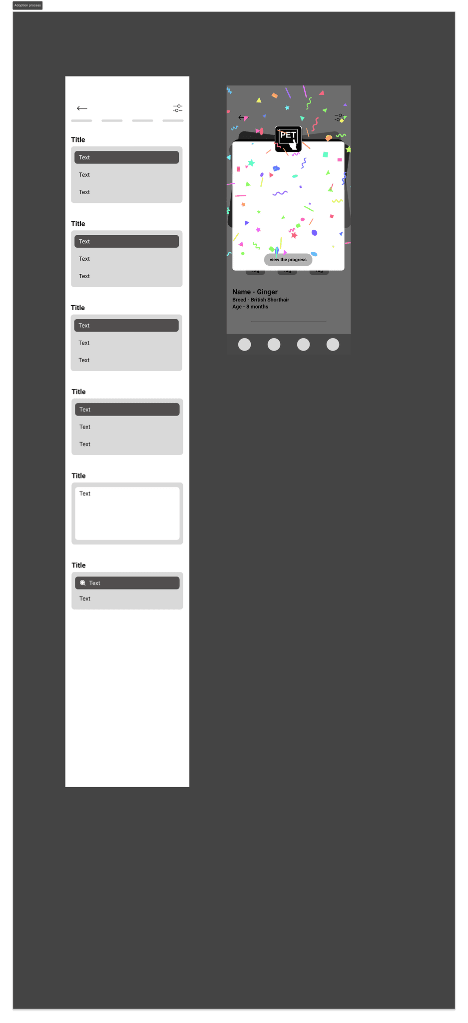
Selection becomes a structured workflow that connects emotional decision-making with procedural clarity. Through a central Inbox, staged application steps and visible status updates, adoption becomes a guided collaboration rather than a single submission.
Beyond approval, the platform extends into post-adoption support, bringing pet supplies and service coordination into one system, from discovery to long-term care.
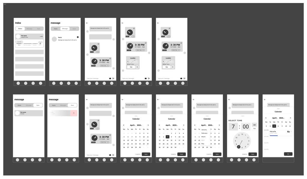
Low-fi prototype
Mood board: a gamified neon palette
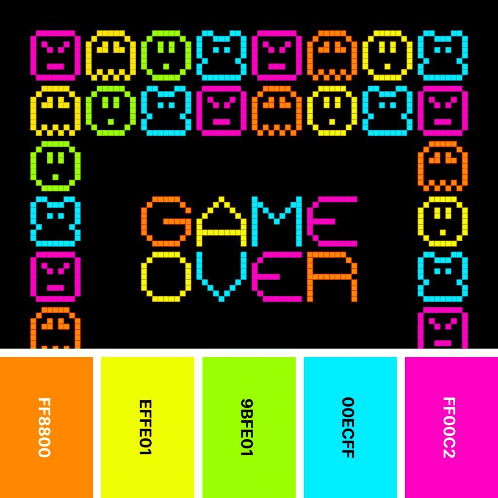
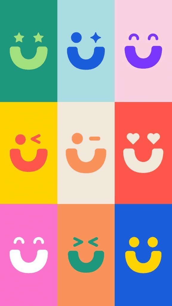
Inspired by arcade-era graphics, the palette uses high-saturation neon tones for energy and visual immediacy. Bold contrasts replace the usual neutral adoption look, shifting the experience from transactional to playful. Color works as both emotion and function: it guides interaction, reinforces feedback and amplifies the sense of a match.

Final design
From decision to conversion: a structured application
- Modular information builds trust.
- Labels and matching prompts raise decision confidence.
- Step-by-step forms reduce the burden of filling them in.
- Confirmation pages give clear feedback and set next-step expectations.
Structured communication, from application to appointment
- The Inbox holds application progress, messages and status updates in one place.
- A to-do list shows each stage, so the current step and the next one are clear.
- An embedded calendar books in-person meetings directly, cutting back-and-forth.
Service extension: from adoption to long-term care
- Pet supplies live in the same app, extending it beyond adoption.
- Clear product structure and pricing reduce decision-making.
- A step-by-step cart and checkout keep users in control.
- Order confirmation gives instant feedback on completion.
Post-adoption follow-up
- Orders, deliveries and history are managed in one place.
- Real-time delivery tracking adds transparency.
- A pet health dashboard tracks basic data.
- Profile and payment details are kept together.
App interfaces
Reflection
Learned that the hardest moment wasn’t finding a pet. It came after approval.
I assumed the hardest moment for adopters was finding the right pet. The research kept pointing elsewhere: the moment people got approved, a new wave of uncertainty began. “What should I buy? What do I do now?” Reducing friction couldn’t stop at the application; it had to carry people into actually owning a pet.
That insight pushed the scope wider, from one adoption flow to supplies, scheduling and post-adoption support. It made sense on paper, but I designed most of it on research scoped around discovery and application, not validated against the post-adoption experience.
What I’d validate next
A second, focused round of research on the post-adoption stage, before committing to how much of the ecosystem to build out.
The initial problem statement is a hypothesis, not a brief. The most useful research is the kind that tells you to move the goalposts.
Next On