Creators balancing online presence and offline creation
AI RecommendWhy this intent exists
Opportunity signal
“How do I set up a community app to avoid constant notifications?”
“What is the best way to limit screen time using Opal app?”
“Should I choose the Opal app or a standard focus app instead?”
“What is the best way to limit screen time using Opal app?”
“How can a focus app help writers protect their creative offline time?”
“Can creative designers use project management software to protect deep work hours?”
Click a step to jump to it
Workfx.AI — steering AI content before it’s written
Users were fixing AI drafts after the fact because the choices that shaped them were hidden. I redesigned Content Creation around three decisions users make before anything is generated.
Information Architecture
Interaction Design
Vibe coding
5 months
Yueqi Men · PM
Michelle Chen · Designer
SaaS · SEO / GEO
Overview
Moved the decisions an AI made for every draft to before generation, where users can make them.
Workfx.AI is an AI-powered content growth platform that helps businesses find search opportunities and create marketing content for SEO and GEO (Generative Engine Optimization: getting content cited in AI answers such as ChatGPT and Perplexity).
My contribution
Owned the information architecture and interaction design of the three-step flow: which decisions to surface, how to group them, and what to call them.
Designed how users review and manage multiple drafts at once, after my PM scoped batch generation.
Built three working prototypes with Claude Code, so design reviews reacted to real interactions, not mockups.
Worked with PMs Sarah Yang and Yueqi Men, who defined what the assistant needed to do, and designer Michelle Chen.
Also designed Workfx.AI’s official website and homepage.
of drafts changed direction after generation, because the choices that shaped them were hidden.
hidden system stages became three decisions users make before anything is written.
chose content unaided · revised their choices before generating, in an 85-user test.
Problem
Found that everything shaping a draft happened out of sight, so users fixed it afterward.
When I joined, Content Strategy already recommended topics and explained why they were relevant. Users chose a topic, platform and language, generated a draft, and refined it through AI chat.
Every generation costs credits and time. When a draft misses the angle, users don’t just lose a draft: they start to treat the AI as a slot machine. For a platform that sells content growth, that is the moment trust drops.
Research
Traced late fixes back to choices users never saw being made.
The project started from beta user feedback on Content Strategy, shared with me by my PM.
Defaults were accepted, not chosen
I just went with the suggestion. I couldn’t really tell what changing those settings would do to the article.
Each suggested direction says what it changes: the audience, their pain point, and the search opportunity behind it.
→ 01 Choose a directionDirection was fixed too late
Once I saw the draft, I realized it wasn’t the angle I wanted. So I went back into the chat to explain it.
Direction, prompts and titles are all chosen before generating, and stay editable until then.
→ 02 Select promptsSystem terms weren’t user terms
I know who I’m writing for and what I want to say. I’m less sure what you want me to choose under ‘intent.’
Every step leads with the user’s action: “Choose a direction”, not “Intent Group”.
→ 01 Choose a directionParaphrased from beta user feedback, shared by PM.
What this looked like for one user
Meet Mia, a marketing lead at a B2B SaaS company, writing about AI search visibility. She picks a suggested topic, hits generate, and reads a draft aimed at beginners. She wanted a comparison for buyers. Three chat messages and 4 regenerations later, she has something usable.
Generate → Read → Fix in chat ↻
Generate → Read → Fix in chat ↻
Where the draft actually got decided
I mapped what users saw against what the system decided. Four of the five decisions happened out of sight.
My working hypothesis
Users weren’t choosing the defaults. They were accepting them, because they couldn’t see how those choices shaped the result. So control happened after generation instead of before it.
How other tools handle setup
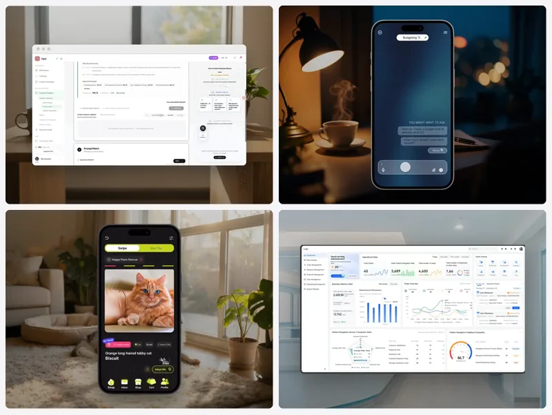
I looked at how Jasper, Copy.ai and Notion AI handle setup. Most either hide it entirely or turn it into a long form. Neither matched what our users asked for.
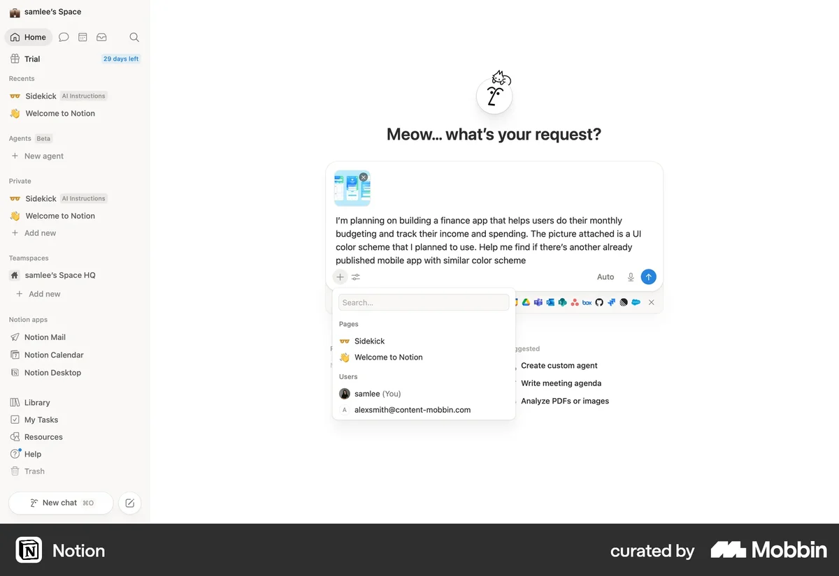
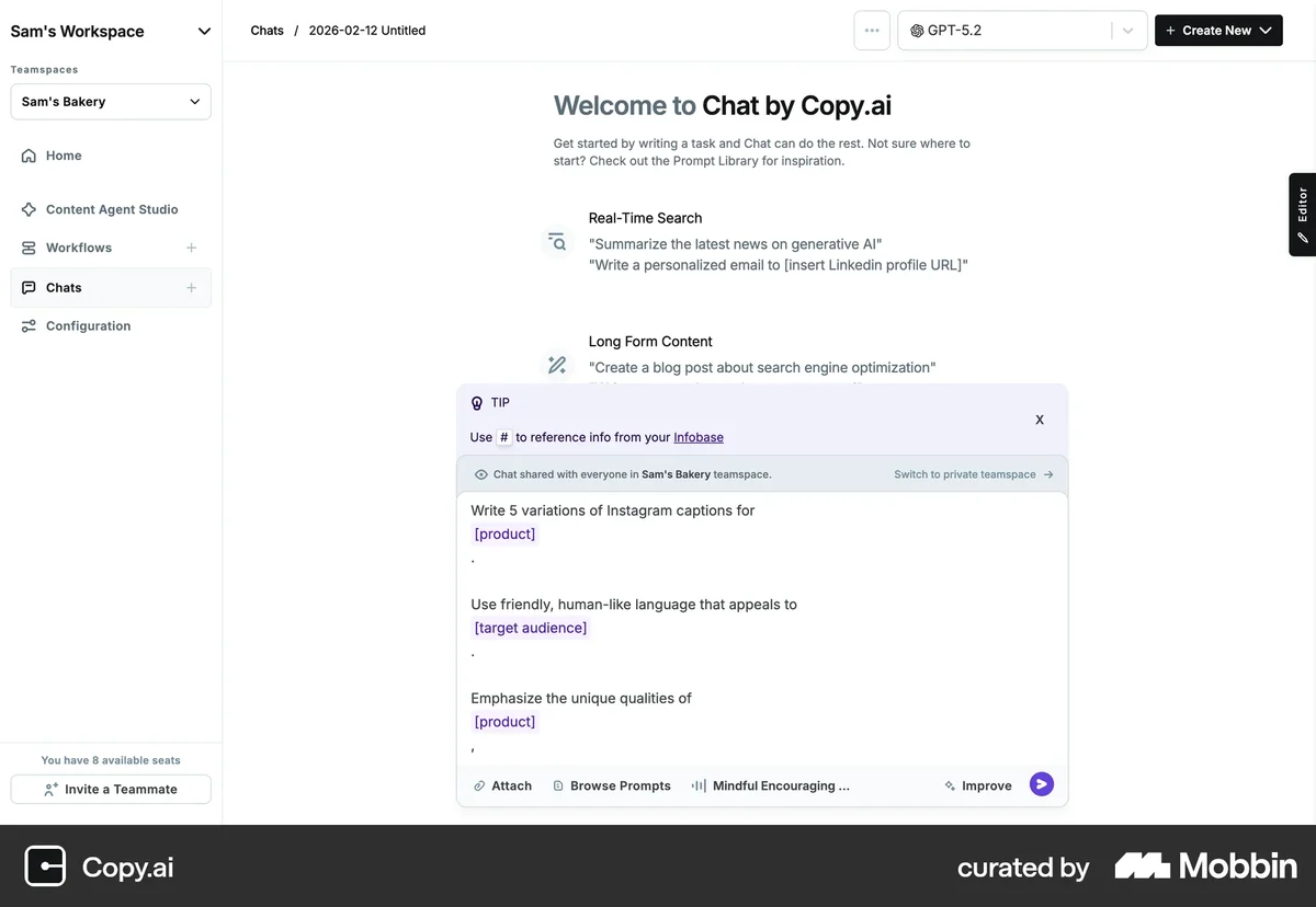
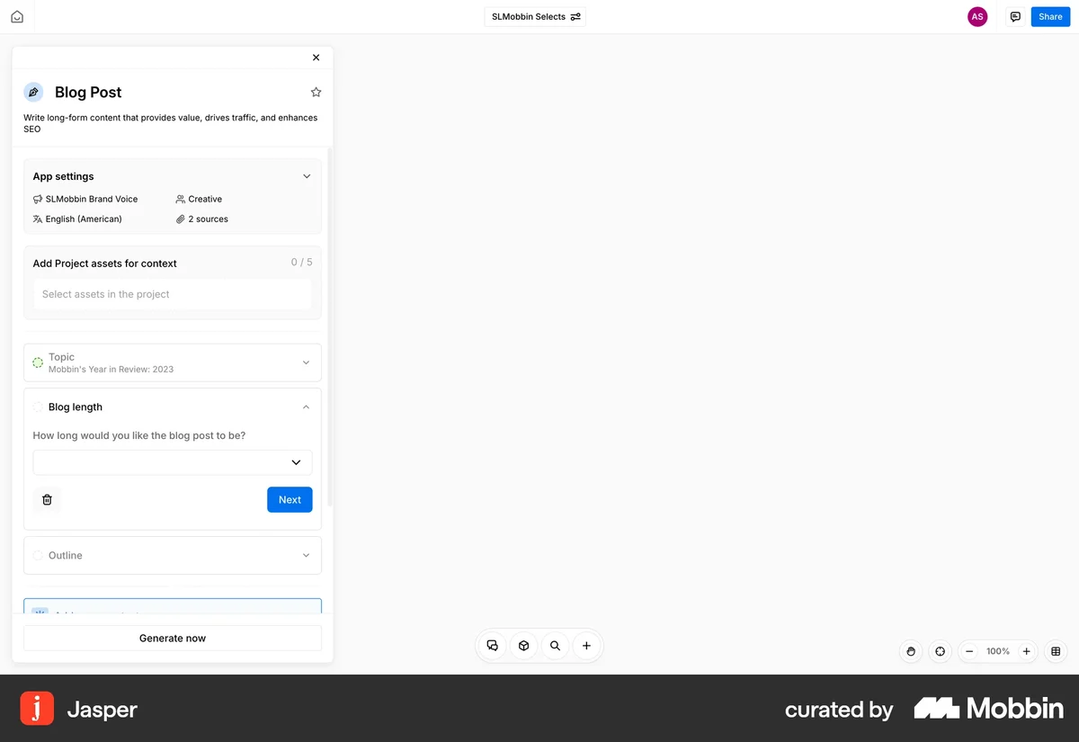
Screens via Mobbin.
Challenge
Owned how the assistant works for users, while my PM defined what it does.
Which decisions to surface, how to group them, and what to keep in the background. Two tensions shaped every decision that followed.
Transparency vs clarity
Show every pipeline stage, and internal logic becomes the user’s job.
Control vs speed
Workspace already gave users a fast, chat-first way to get a draft. That freed Content Creation to slow down where it mattered and ask for decisions before generation.
Design
Turned five system stages into three decisions users make before generation.
01Choose a direction
Each suggested direction explains why it exists (audience and pain point) and shows the search opportunity behind it: related keywords, total searches and competition. If none fit, users add their own.
Creators balancing online presence and offline creation
AI RecommendWhy this intent exists
Opportunity signal
02Select prompts
Picked prompts stay pinned at the top, each tagged with its funnel stage and intent group. Below them is a pool of real user questions to add from.
“How do I set up a community app to avoid constant notifications?”
“What is the best way to limit screen time using Opal app?”
“Should I choose the Opal app or a standard focus app instead?”
“What is the best way to limit screen time using Opal app?”
“How can a focus app help writers protect their creative offline time?”
“Can creative designers use project management software to protect deep work hours?”
03Shape the output
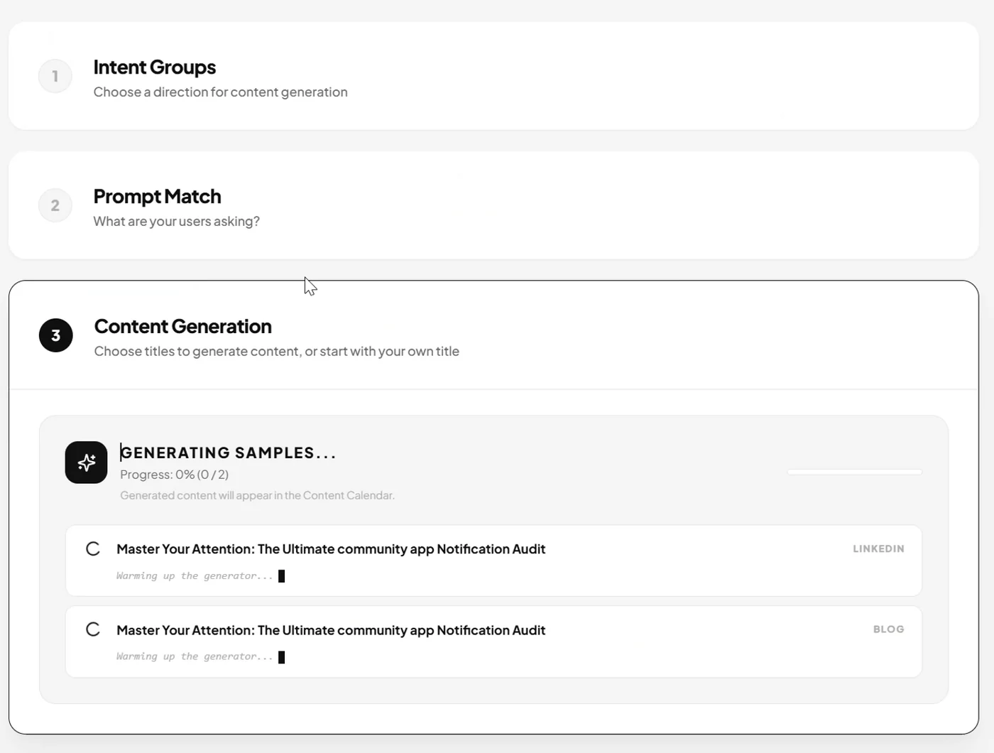
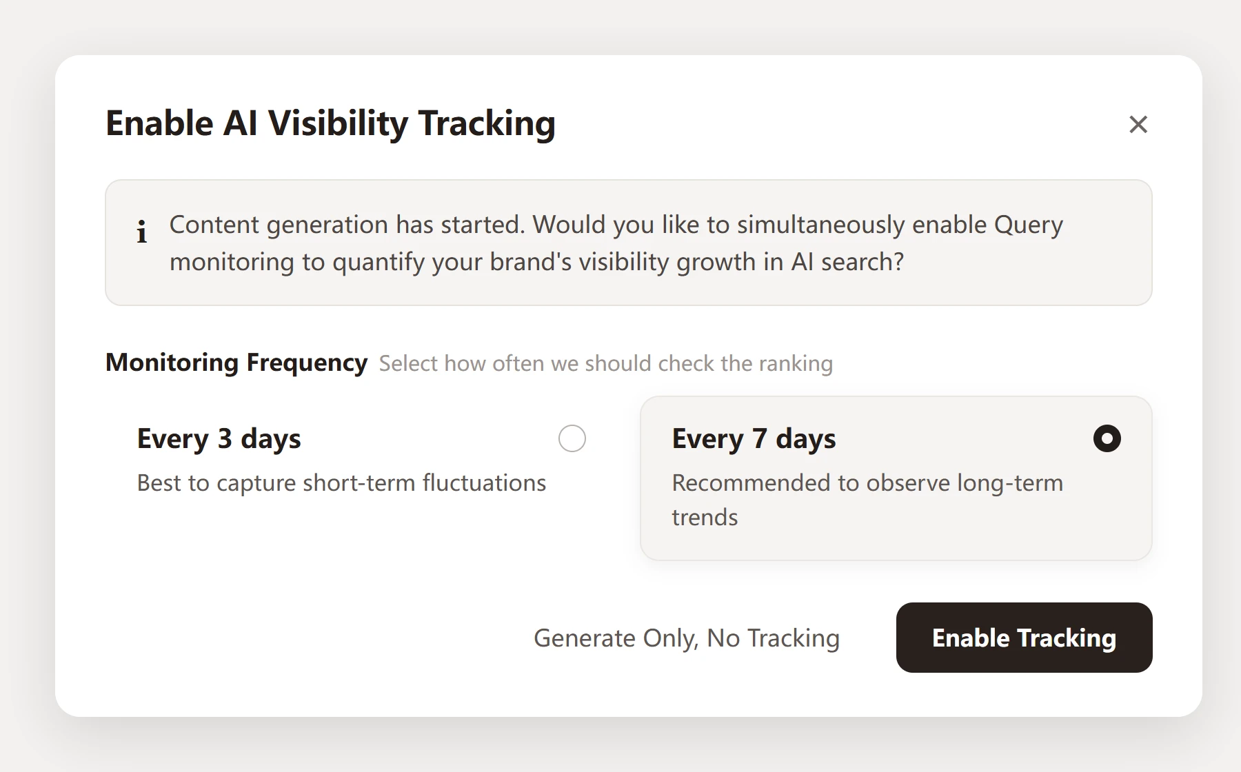
Users filter the title pool by content type (comparison, scenario, risk alert, deep dive), add their own title, then set platform, language and how many articles before one batch generate.
Back to Mia
She chooses the direction “Buyers comparing vendors”, picks the 3 real questions they search for, and keeps one title per question. 3 drafts generate together, each already pointed the right way.
Direction → Prompts → Titles → Generate
How it fits with Workspace
Content Creation doesn’t replace Workspace. They serve different needs.
| WorkspaceTask-oriented | Content CreationDecision-oriented | |
|---|---|---|
| 01 | Starts with a conversational prompt | Starts with selecting a content direction |
| 02 | Quickly initiates a creation task | Gradually defines personalized content |
| 03 | Presents results through conversations, tasks, and assets | Organizes the process around intent, questions, and content |
Process
Prototyped three rounds in code, each answering one question.
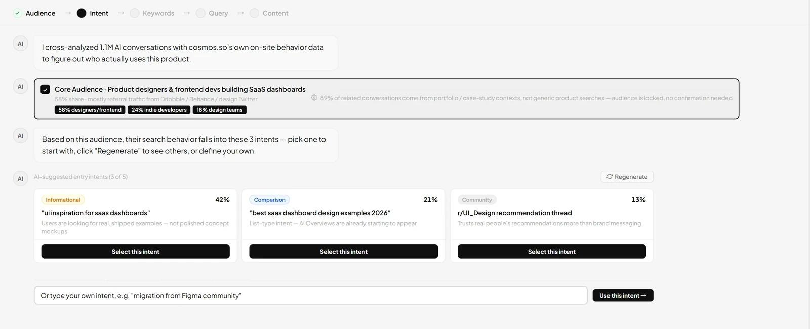 V1Which decisions matter?Showed every stageFelt like one question asked three times
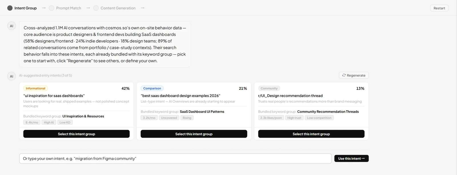 V2How should they be described?Five stages became threeClearer, but earlier choices scrolled away
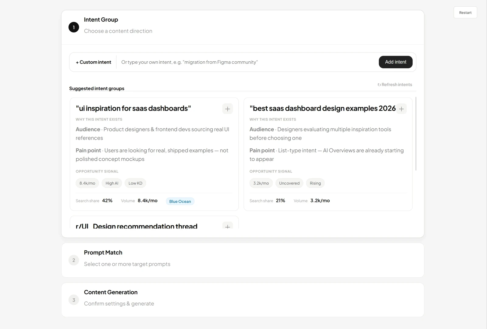 V3How do users keep track of them?A step-by-step panelShipped · 75% chose unaided
The system was already making five decisions for every draft. What if users made those decisions themselves, before a single word was written?
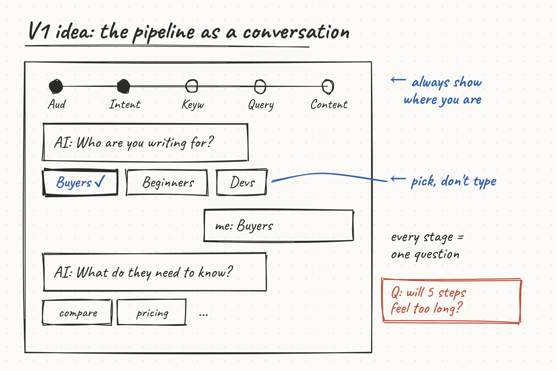
I weighed three routes against the beta feedback.
Smarter defaults
- Nothing new to learn
- Only improves the guess
- Users still accept instead of choose
A settings form
- Every choice is visible
- Turns the pipeline into a configuration job
- Same “what is intent?” confusion
A guided conversation
- Users already chat in Workspace
- The AI proposes options, so no blank fields
- One decision at a time
Two rules came with it: decide before you generate, and pick, don’t fill.
Three rounds, one question each
I built all three prototypes with Claude Code, so each version was a working, clickable flow rather than static screens. V1 and V2 were reviewed internally, so early decisions rested on our judgment; the first round with users was the 85-user test on the final flow.
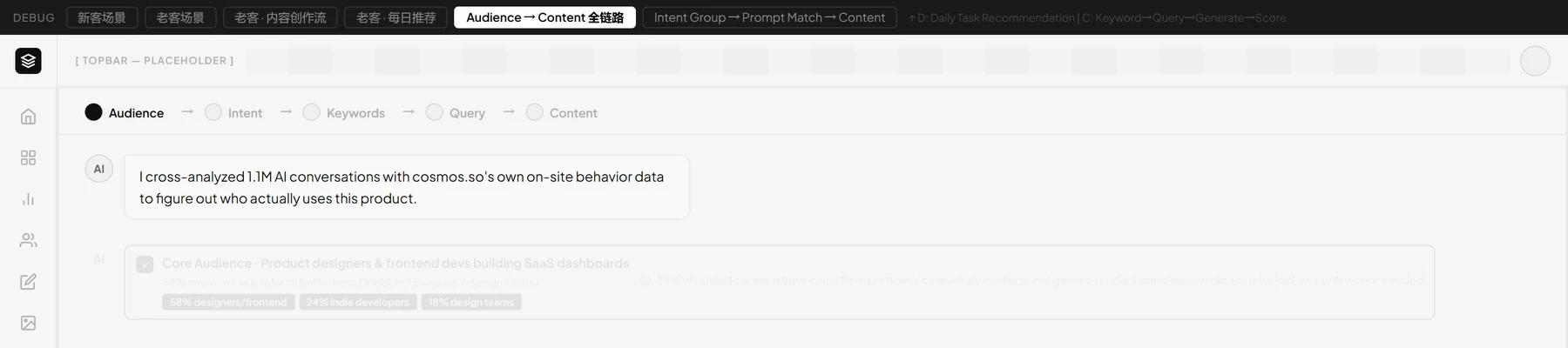
Iteration 01
V1Showing every stage
The first iteration turned the five-stage pipeline into a guided AI conversation. A progress track (Audience → Intent → Keywords → Query → Content) showed where users were, and at each stage the assistant proposed options.
12- 1A five-stage track: Audience → Intent → Keywords → Query → Content.
- 2At each stage the assistant proposed options to choose from.
Design review
PM and engineering spotted the problem: three of those stages described the same opportunity from different angles. Users were asked about it three times before seeing any content.
“Intent, keywords and query feel like the same question asked three times.” — PM, V1 design review
Making every stage visible didn’t make the decisions clearer.
Iteration 02
V2Grouping inputs into a content direction
V2 kept the conversation but reduced five stages to three. Each direction bundles an intent with its keywords, users pick real search prompts as targets, and each prompt becomes its own titled draft, since SEO/GEO content typically targets one search question.
12- 1Five stages became three: Intent Group → Prompt Match → Content Generation.
- 2Each direction bundles an intent with its keyword group.
Grouping related system concepts around a user goal made each decision easier to understand. But in a chat thread, earlier choices scrolled out of view.
Iteration 03
V3From a conversation to a structured workspace
V3 moved the three stages out of the chat into a step-by-step panel. Completed steps collapse, so users always know where they are and can go back to any step. Each step leads with the user’s action, not the system’s term: “Intent Group” became “Choose a direction”.
123- 1Steps lead with the user’s action: “Choose a content direction”.
- 2Each direction explains itself in plain words: audience, pain point, opportunity.
- 3Other steps collapse, so users always know where they are and can go back.
My PM scoped batch generation; I designed how users review and manage multiple drafts at once.
Giving users more options was not enough. They also needed a clear way to see and manage what they had already chosen.
Impact
Shipped in the Aug 2026 beta, with users making the calls before generation.
Unmoderated usability test with 85 users from Workfx.AI’s partially opened beta, run by the Workfx.AI team on the final three-step flow. Content Creation shipped as part of the beta in Aug 2026.
completed content selection without assistance
correctly identified and revised their choices before generation
Tasks: choose a direction, select prompts, and adjust choices before generating.
Reflection
Learned that clarity comes from choosing what to show, not from showing more.
Transparency isn’t the same as clarity. V1 showed every stage of the pipeline and was harder to use because of it. The work wasn’t exposing the system; it was deciding which parts deserved a user’s attention, in the user’s words.
People need to see what they’ve already chosen. V2 made each decision clearer, but earlier choices scrolled away. More options only helped once users could see and manage their current state.
Prototyping in code changes the review. Working flows let PM and engineering react to real interactions, which is how the V1 repetition surfaced before any user saw it.
What I’d validate next
Testing showed users could make and revise these choices. It didn’t show whether earlier control leads to better content. Next, I’d compare drafts from the new flow against the old one: how often users still rewrite the direction in chat afterward, and whether they keep coming back to Content Creation over Workspace.
The hardest part wasn’t showing users what the AI does. It was choosing which few decisions were worth their attention.
Next On